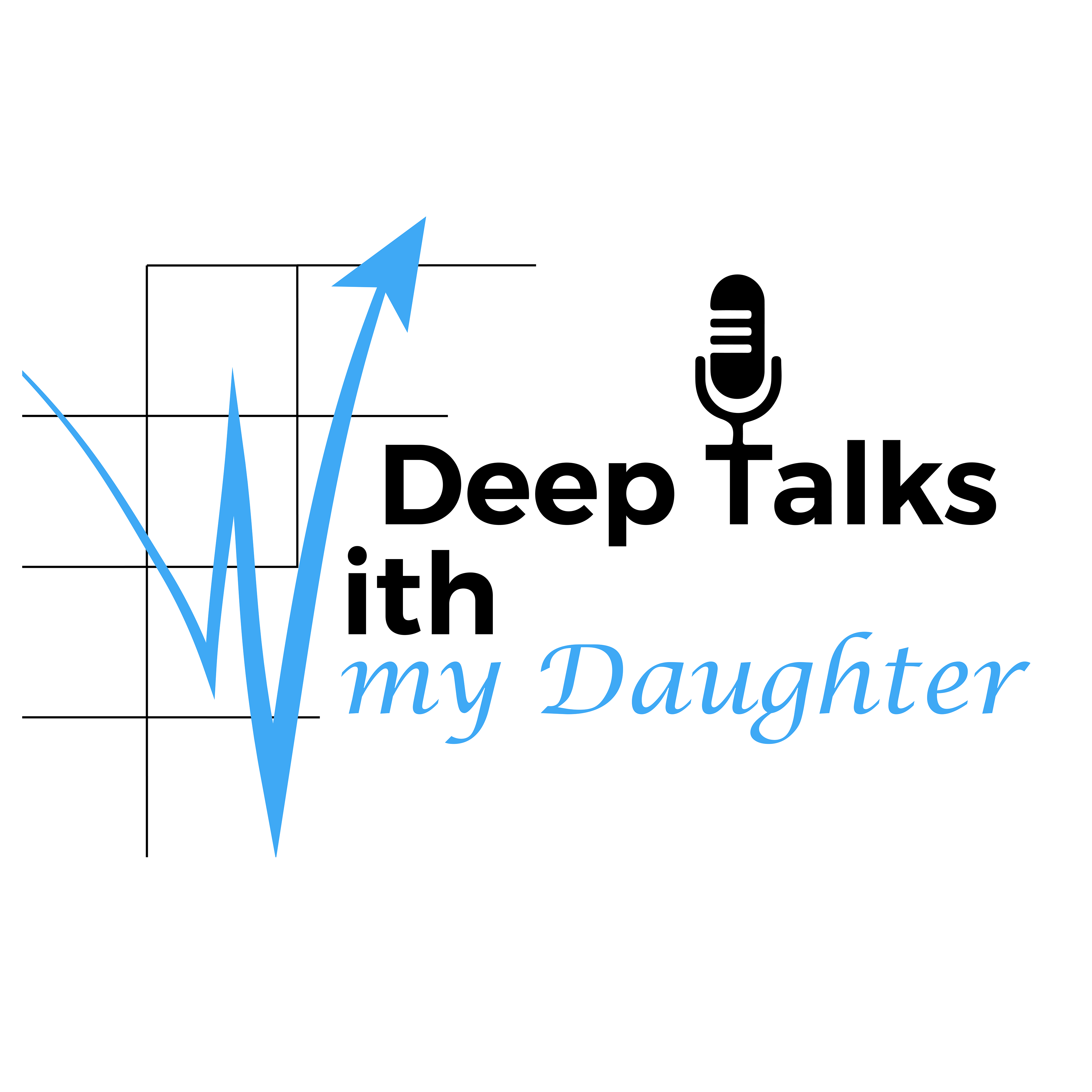
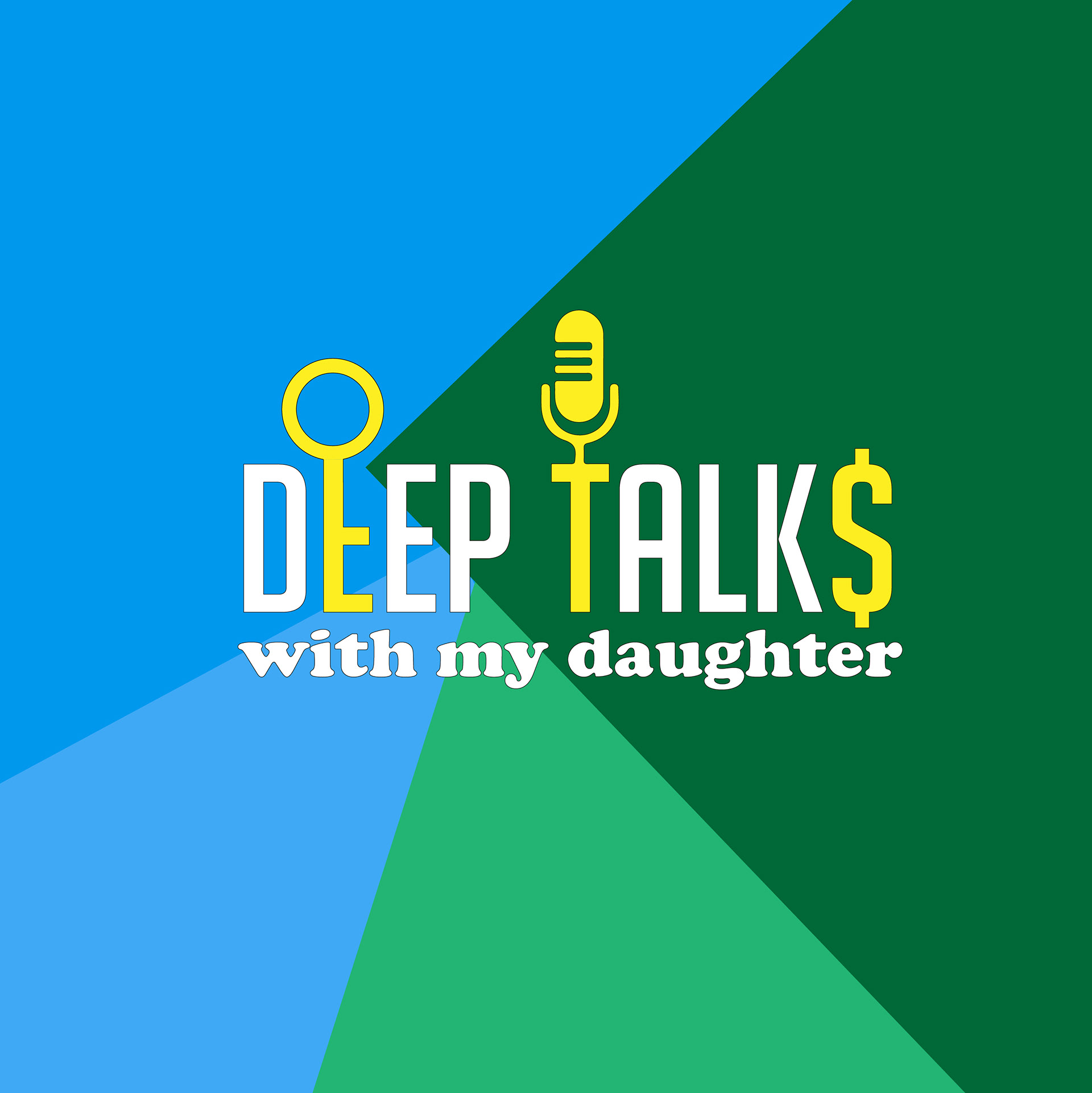
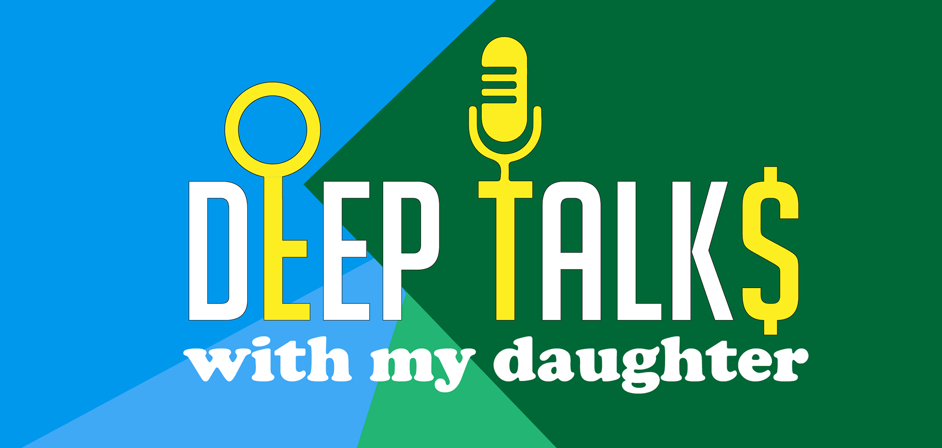
The client requested a logo for her father / daughter podcast, with an emphasis on motivating and coaching people in the financial sector. The client was focused on bringing a softer image to the podcast logo, while keeping the serious nature of finance first and foremost
Solution: I chose colors that were complimentary and usually associated with masculinity, wealth and calming. Using a bold sans serif font for the top line to indicate stability and strength. On the second line I chose a rounder serif to give the logo a nurturing and wholesome feel. Finally, I added elements of security finance and the nature of podcasting itself, to immediately give the target audience a clear message of what this podcast is about.